Building With Hope and Faith
Last time we revealed our exterior transformation of the Cabin That Grew Up On a Hill. There was so much detail to this project that we saved our coverage of the interior for this edition of our newsletter! Can’t wait to see inside? Here we go.
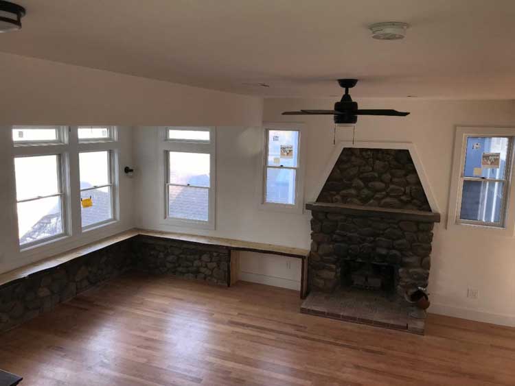
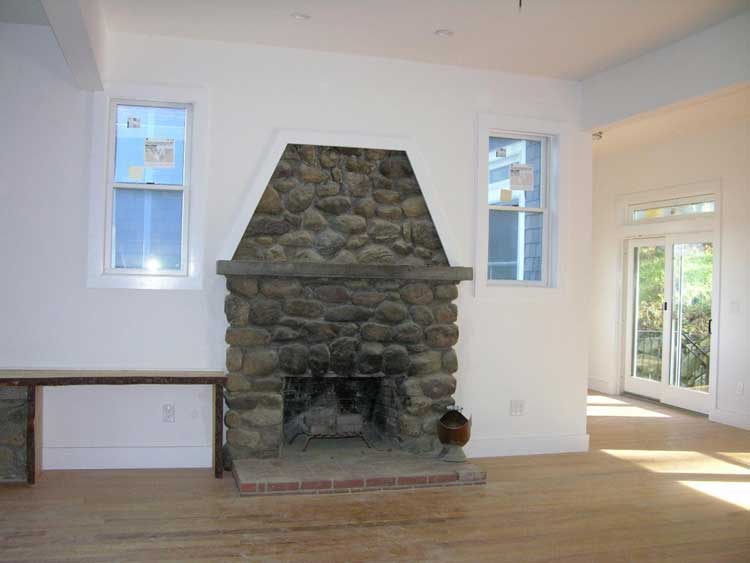
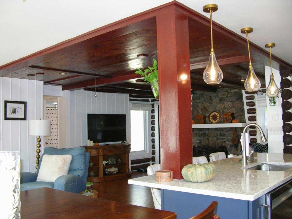
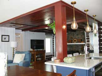
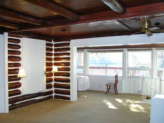
The homeowners wanted to keep the stone fireplace of the original home. A unique feature of the house is that the stone walls of the exterior of the house are visible on the interior as well. This area, with a band of windows above the stone walls, used to be an enclosed porch.
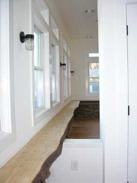
The existing windowsill was in poor condition so a new live edge sill was added.
This is wood that still has bark along the edge. The rustic look really compliments the old stone walls.
The house has 3 distinct sections. How cool is it that you can see parts of the outside of the house from different vantage points when you’re standing inside?
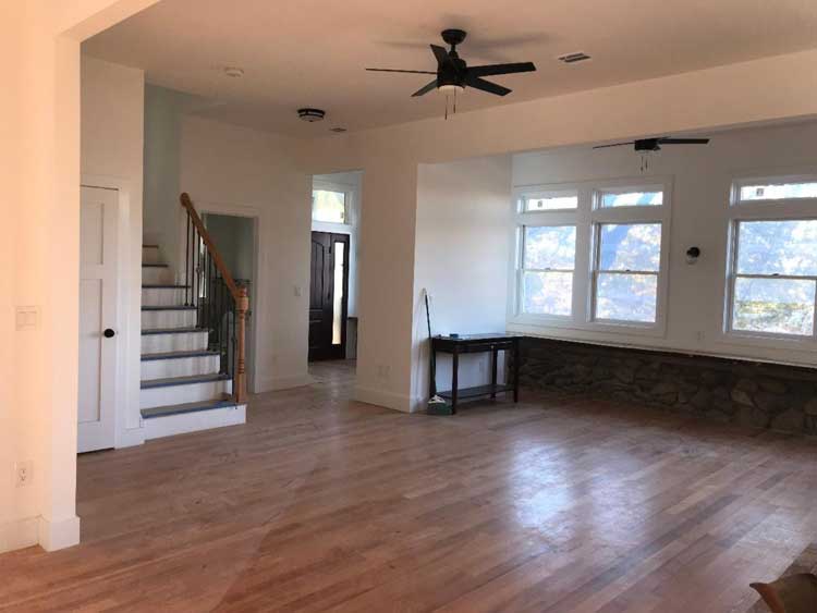
After construction, the main part of the house now features 10 ft ceilings and an open floor plan. The original enclosed porch has now become part of the living room, which naturally enlarged the living space. A stunning collection of windows contributes lots of natural light.
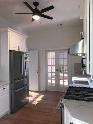
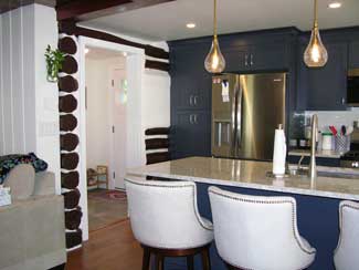
There are new glass doors separating the dining room from the kitchen. This way the home chef can see what’s going on in the dining room while containing cooking smells in the kitchen.
Before the renovation, the 2nd floor of the house was a modest loft that overlooked the living room with 2 small bedrooms and a bathroom; and there wasn’t a lot of head space.
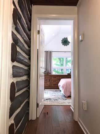
Now the second floor is a full-sized space containing 3 bedrooms, with 2 in the back, and the master suite at the front of the house taking advantage of the beautiful view.
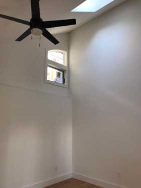
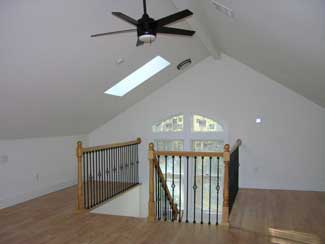
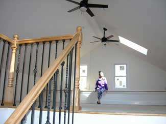
Above the second floor is a spacious walk-up “attic” with large windows and a skylight, making it light and bright. It’s so beautiful, we hate to call it an attic – It’s a beautiful finished space, not a dark unpleasant area filled with boxes of stuff.
In addition to the finished walk-up attic there is now a full height basement. This is also partially finished and has a full bathroom and a door to outside.
The first floor also acts as the indoor connector to the in-law suite, via a set of stairs. The garage and connector piece were both new footprint to the house.
From the 1st floor level of the main house, you enter the enclosed and heated breezeway, a wide hallway with windows on both sides. This leads to a set of stairs that takes you down to the in-law suite.
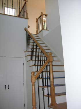
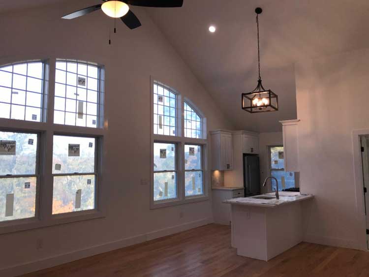
Located above the new 2-car garage, this is a perfect space designed for the homeowners’ aging parents. It features cathedral ceilings and a large custom arched window that serves as a focal point and provides sweeping views of the valley. The suite is a comfortable sized apartment, with bedroom, study, living room and kitchenette, (mini kitchen).
Do you have transformational dreams for your house and
simply can’t “see it happening?”
Click below to get started.
If a friend forwarded this to you, this does not mean that we have added you to our list. However, if you would like to receive our updates, click below.
Building With Hope and Faith
Imagine this – when the forecast calls for freezing temperatures, that means you run downstairs and shut off your water so that the pipes in the kitchen don’t freeze.
Are we describing a living situation decades ago? Actually, a client we just worked with had been dealing with this very challenge. As you can imagine, they were more than ready for a renovation!
They were also more than ready for us to end another (slightly less dire) predicament. In their lovely and charming craftsman style cape cod home, there was only one bathroom. It was on the main floor; and the master bedroom was upstairs. Imagine navigating a dark, enclosed staircase in the middle of the night to use the facilities!
Fortunately for them, we were able to make both those issues disappear – and give them even more reasons to love their home.
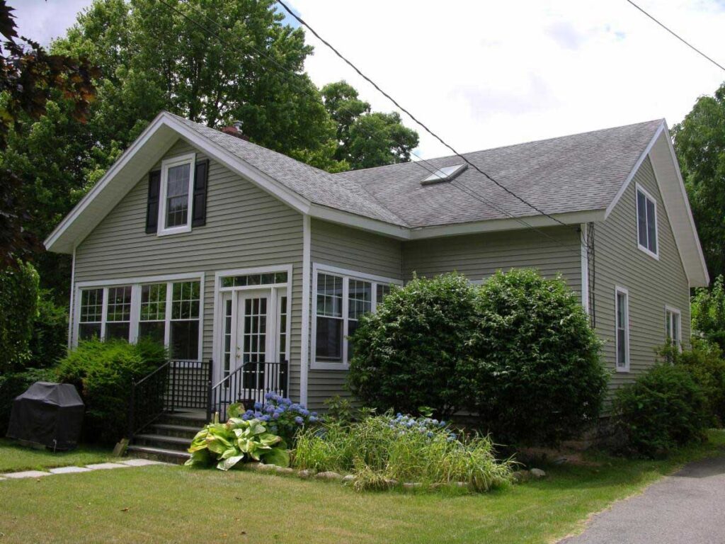
The homeowners loved the character of their cape cod home and its craftsman style architecture. They were ready for “modern conveniences” but didn’t want to give up the personality and artful design of the home. It became our mission to honor the history and style while upgrading with modern conveniences where possible.
Craftsman style homes are an American architectural tradition that emerged and spread between 1900 and 1929. It railed against the mass-produced, Industrial Revolution-fueled Victorian architecture boom that celebrated manmade materials. Craftsman architecture was an ode to the beauty of natural materials and forms, and the marvels of what humans can make with their own hands.
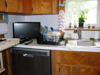
The house had a small previous addition to the kitchen that was built on concrete piers rather than a standard foundation, so it was open underneath. In freezing temperatures, the kitchen sink froze, so the homeowners had a regular routine of shutting off the water to prevent the pipes from freezing, which naturally meant they had no running water in the kitchen during this time.
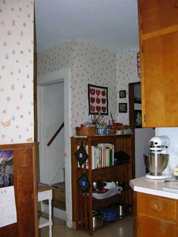
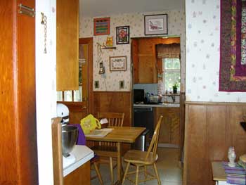
While the homeowners loved the beautiful woodwork in the home, plus its personality and charm, their kitchen was comprised of three small choppy spaces: there was a little porch, a small addition tacked onto the back of the house, and the original kitchen.
The kitchen before
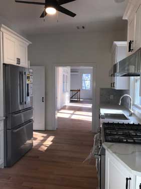
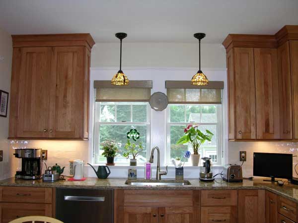
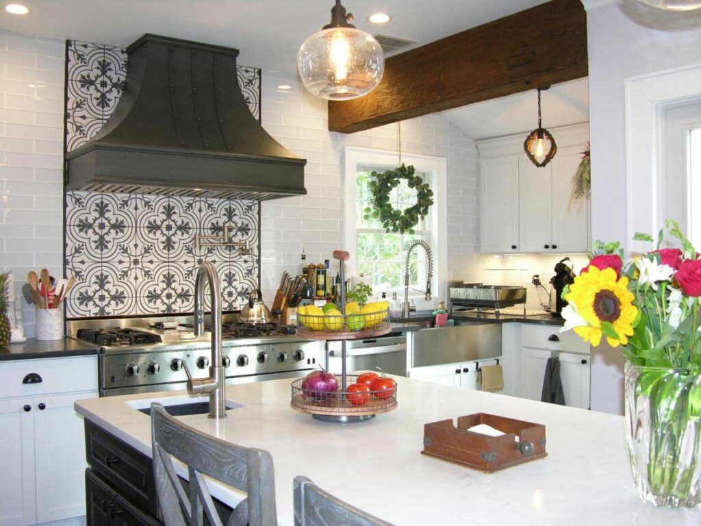
In our design, the porch and tiny addition were removed. We designed a new addition and an entire kitchen renovation. While it used to be dark, the kitchen is now light, bright and airy, featuring craftsman details to match the rest of the house. How do you bring some craftsman detailing to your interior? The craftsman styled cabinet doors complement the existing house and the painted wood trim on the windows and doors match the stained trim found elsewhere. The stained-glass light fixtures as well as the period switch plate covers enhance the look.
Initially, the homeowners were concerned that they would end up with a standard modern, cookie cutter kitchen. Instead, they were delighted that the new design was perfectly in line with their style preferences. Oh, and the pipes don’t freeze now.
The kitchen after the renovation
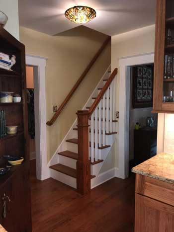
The staircase to the second floor had been fully enclosed with walls and a door. In our design, we allowed the natural light to flow through the area by opening up the stairwell.
Removing the walls allowed the home to show off the natural beauty of the newly replaced stairs, which with our design, now end in an elegant railing with a craftsman newel post. Because the staircase is situated at the edge of the new kitchen, the whole space feels larger.
As mentioned before, the existing house had only one bathroom which was situated on the first floor. The master bedroom on the second floor really needed its own bathroom, for the convenience and safety of the homeowners.
A cape cod home has a steep roof area, so we used some of the unfinished attic space that was on the same level as the bedroom. It already had a high enough head height to be able to carve out a new master bathroom.
Fortunately, that part of the attic even had a window to help make the bathroom a light and cheery space.
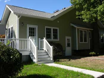
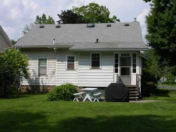
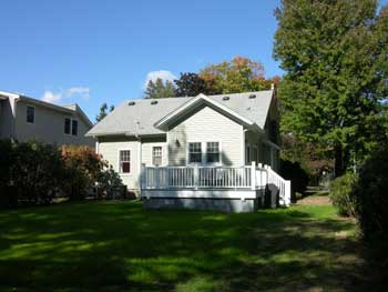
To complete the look, new siding and trim enhanced the curb appeal while keeping to the character of the existing neighborhood, full of older homes. The new siding and trim totally changed what it looked like without sacrificing the character or making it look out of place.
Out went the old concrete patio in the rear of the home, and in its place came a lovely new deck at the kitchen level. Even the detached garage was updated with new siding to complete the picture.
Inside and out, these updates kept the personality and charm of their preferred style, yet totally transformed the experience of living in the house for the owners.
If you like most of your house but there’s a few things that really need to change, you don’t have to find another home and move; you can stay there and renovate the parts that aren’t working for you. Let us help you bring those particular spaces up to the same caliber as the rest of your house and still keep the charm of the original home.
You can upgrade your kitchen or expand other parts of your home to meet your particular needs and lifestyle, while keeping the quaint character of the house.
For some of our clients, their home was built in the 1900’s but they want the conveniences of the 2000’s. How do we make it happen without your home looking disjointed? We know how to keep that look and feel of the original character of your home and design renovations that respect its history.
Do you have transformational dreams for your house and
simply can’t “see it happening?”
Click below to get started.
If a friend forwarded this to you, this does not mean that we have added you to our list. However, if you would like to receive our updates, click below.
Building With Hope and Faith
Perhaps at one point in your homeownership, you loved your kitchen! It had certain features that brought a smile to your face every morning. It could be the way you enjoyed the view of your garden from the window above your kitchen sink. It could be that the countertop and cabinets flowed in your favorite soothing neutral shades.
But Is It Standing Up to the Test of Time?
Over the years, your tastes and needs changed. Of course, painting the walls and switching the hardware are easy ways to quickly jazz it up. But if you’re like many homeowners, you have started to realize that there are some features that are not as handy or attractive as they once were.
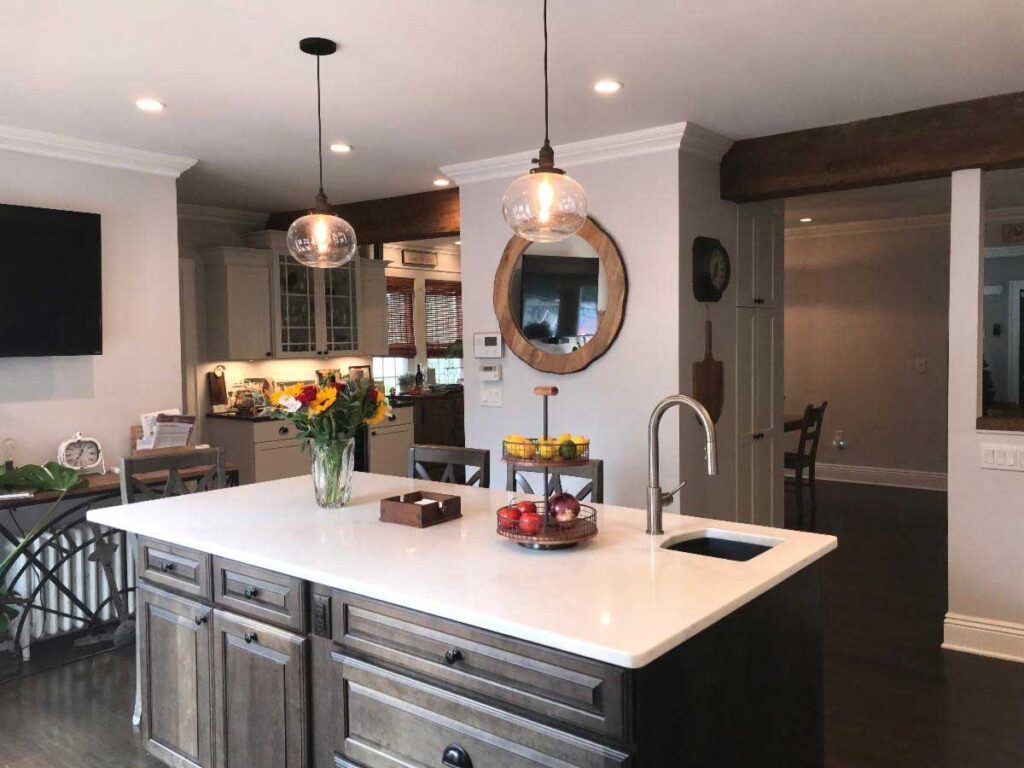
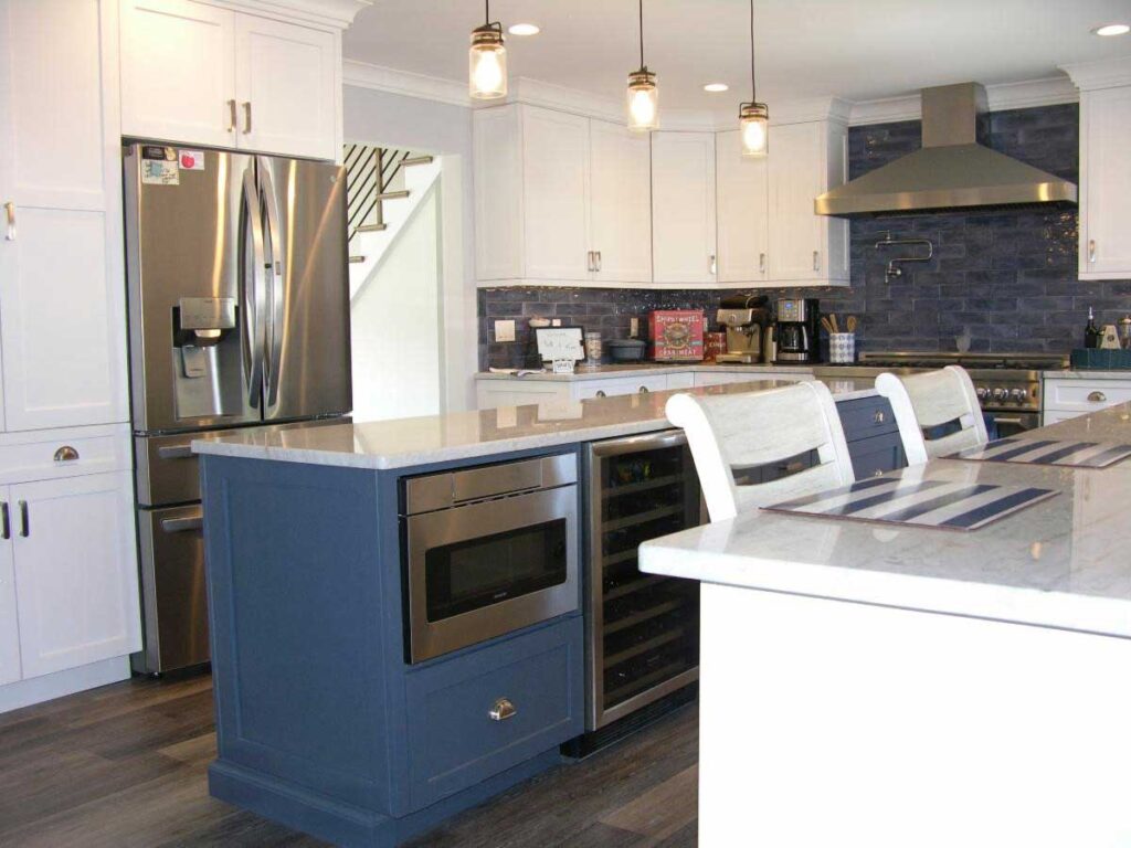
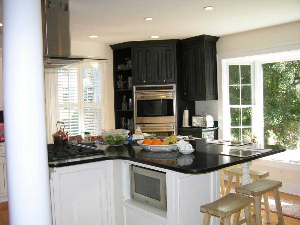
At first you loved your kitchen island, with the range in the middle. It was so convenient! But with time you realized there’s not a lot of counter space on either side of the range and the oven is across the room – a little dangerous when transporting a hot dish from stove to oven. Is there a way to build a bigger, roomier island with plenty of work and storage space, and move the cooktop close to the oven? Of course there is, but it’s not exactly a weekend do-it-yourself project!
Or you’ve always wanted a kitchen island, but your narrow room precluded the addition of one. Your kitchen island can be a flat all-workspace or it can incorporate a second sink to help with food prep. Wouldn’t it be great if you could move a wall here or there to restructure the layout of your kitchen and fit an island, and whatever else you want, in your kitchen?
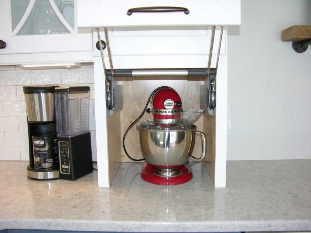
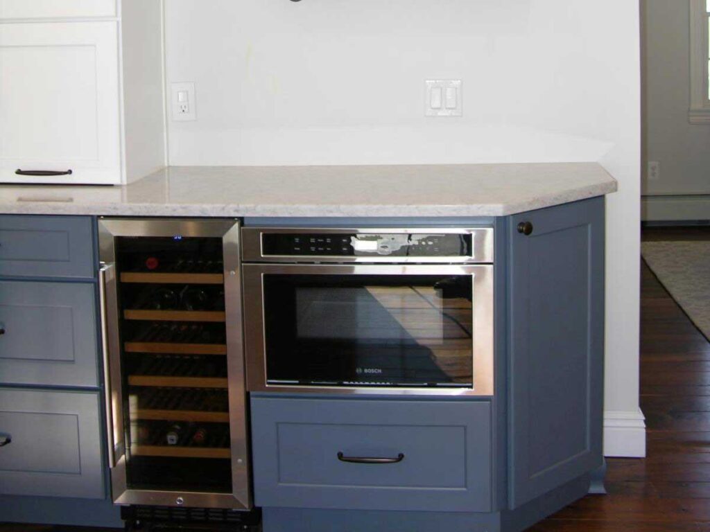
Many of today’s modern kitchens incorporate a separate cabinetry station that stores coffee mugs and wine glasses, has a wine fridge below and a small countertop above to hold the coffee maker. It’s not just cute, it’s super-efficient! Above the counter you can imagine beautiful glass-front cabinets that show off your sparkling wine glasses. Wouldn’t it be great to add this to your kitchen without the room feeling crowded and interrupting the flow?
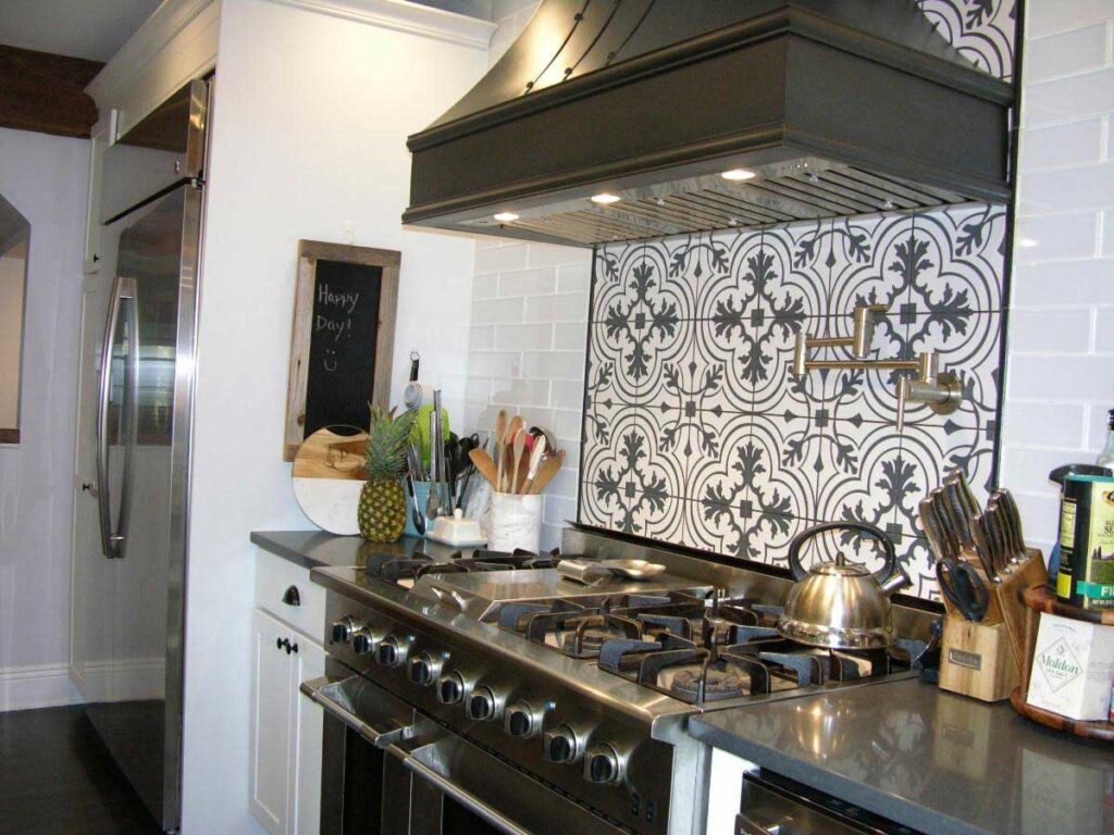
For anyone who has filled a large pot with water at the sink and then had to carry those sloshing gallons of water across the room to the stove, you’re probably wishing and hoping to someday incorporate a pot filler faucet. Built into the wall over the stove, the pot filler faucet has an articulated arm that swings out over the stove burners to fill pots with water. You can also extend the arm to reach pots on the counter just beside your range area.
Without taking up any counter space at all, home chefs love pot filler faucets because of the higher water pressure and flow, leading to less time and effort spent filling. It’s a great safety and efficiency feature that many modern home chefs love.
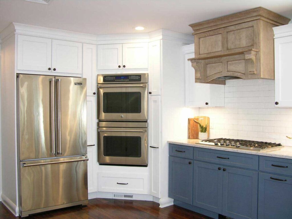
Perhaps you’d prefer to move your microwave away from the stove and over by the wall with the oven. And then you can have room above your stove for a beautiful range hood. Not only venting the food smells and heat, range hoods come in a variety of designs, colors and materials and can add a wow piece to your kitchen.
Will you be living with other family members in the future? Will someone in the family need special accommodations? Besides simply enlarging the kitchen space, we can also incorporate specific designs such as varying counter heights and a microwave built into the base of an island. We can design the kitchen for a much larger commercial size stove or an expansive island.
Another new trend in floor plans is bridging the space from the back door through the mudroom and/or laundry room to the kitchen. You’ll wonder why all kitchens weren’t designed like this.
Don’t you wish you could just pick up your kitchen and shake it all out, like a rug, so you could reassemble all the pieces to where they should go?
It’s one thing to update your cabinetry or counter or backsplash. It’s a whole new ballgame to completely redesign your kitchen’s floor plan to reshape it and reconfigure where all your cabinetry and appliances are located.
And if you’re like many of our clients, you stare at these four walls, convinced it just can’t happen for you. But when we listen to your needs and wishes as we tour your space with you, we often see possibilities you’ve overlooked.
Our favorite client expression is, “we never thought we could have exactly what we wanted, but you helped us make that happen!” Our years of experience have given us the ability to match your dreams to your new awesome kitchen.
Do you have transformational dreams for your house and
simply can’t “see it happening?”
Click below to get started.
If a friend forwarded this to you, this does not mean that we have added you to our list. However, if you would like to receive our updates, click below.
Building With Hope and Faith
We enjoy taking on a variety of home renovation projects of all sizes. We shared the first part of this design story last month, where we gave you a tour of the exterior of this renovation transformation. This time, we’ll give you a guided tour of the beautiful new interior. We hope you love this as much as we (and the homeowners) do and can visualize your own home achieving a design upgrade.
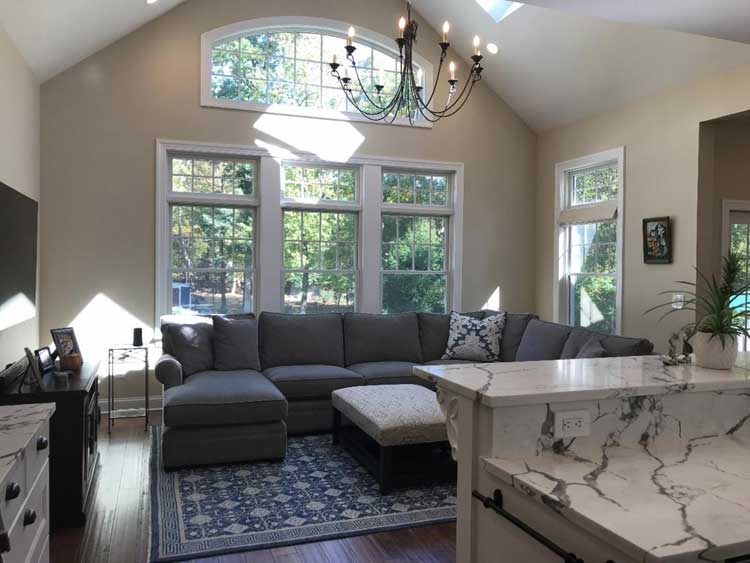
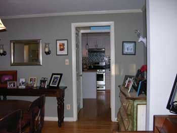
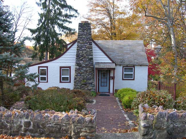
This traditional Cape Cod style house used to consist of small walled off spaces and doorways. During design discussions, our homeowners came prepared with a wish list, and at the top of the list was an open floor plan, a larger kitchen, an expanded basement, and a new great room.
Great Rooms are not a new concept, dating back to medieval castles. Today, great rooms are combinations of several different rooms in a home. It can typically include a living room area, dining area, and kitchen or bar area. It is an open and inviting space for family and guests to enjoy entertaining and relaxing.
The house now has a new addition, which you cannot see from the front. In this new space, we created the Great Room they had always wanted. We redesigned the kitchen for a larger footprint and removed the walls.
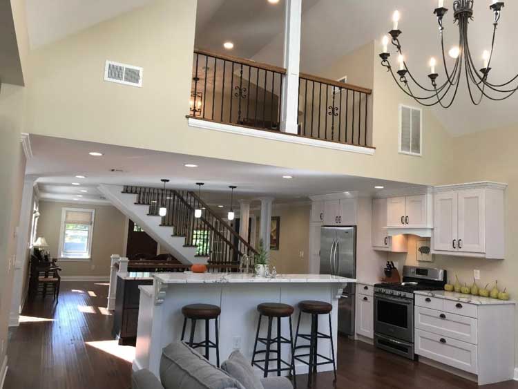
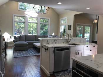
To open things up further, the kitchen flows right into their new great room, which has a vaulted ceiling and a lovely view of the swimming pool in the backyard. The whole area is bathed in light from all the windows and skylights, and the now-open floor plan.
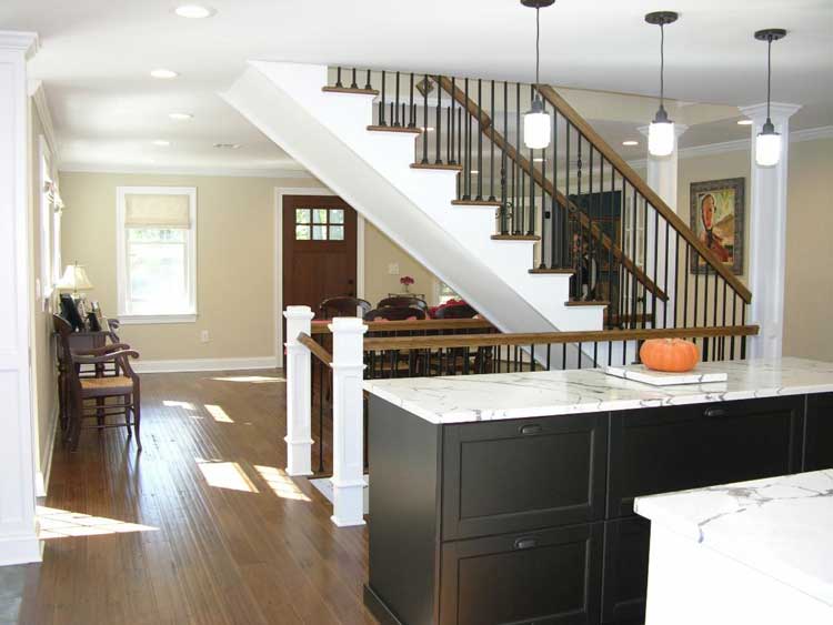
Our homeowners wanted to open up the dining room area, but there was a staircase right in the middle, surrounded by walls. It completely interrupted their vision of an open floor plan. This dining area connected to the great room and the kitchen.
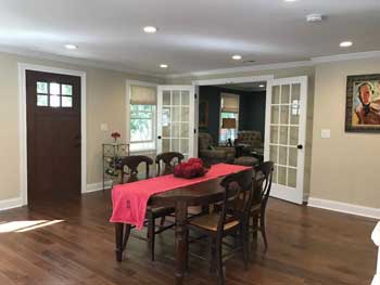
While the homeowners couldn’t see how it could be accomplished without relocating the stairs, we designed the stairs to be in an open space. Their dream came true: when you open the front door you have an uninterrupted view straight through to the back windows.
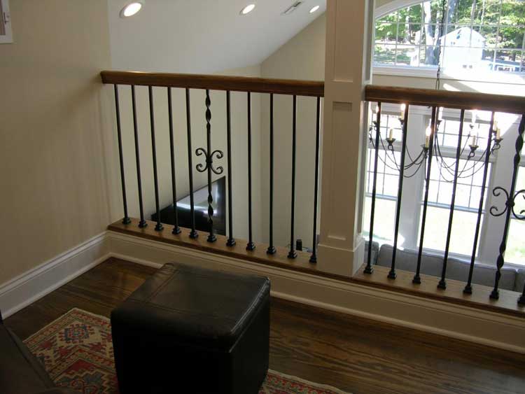
While designing the great room, we added a surprise we knew they would love – a balcony on the 2nd floor that overlooked the great room. They were overjoyed at getting this bonus they had not imagined. There’s a high window in the great room. When you’re on the 2nd floor balcony you can see the back yard through the large window.
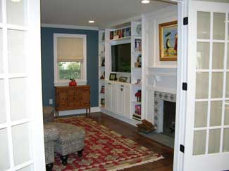
— The former living room is now a reading room with glass French doors. An open floor plan has many advantages, but now it was important to establish a quiet and private area that can be closed off with doors. This was the perfect spot and size for a cozy library.
— Another part of their wish list was to make their existing first floor bedroom into a master suite with walk in closet and private bathroom.
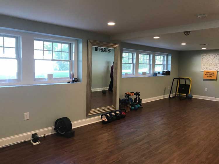
— In the basement area under the new addition, our design included a yoga studio. If you’re going to make this your forever home, it’s important to include the features that will make the space enjoyable and functional for many years to come for your personal goals, taste and preferences. In the yoga studio, the full-sized windows have a view to the backyard, making it a lovely and peaceful place for fitness and meditation.
Before the renovation there was one entry into the basement which was down the interior stairs. We added an additional entry directly from outside and also connected the old and new basements.
It all added up to taking a traditional Cape Cod house from modest to sensational.
Our homeowners had been living there a long time. They loved their style of home, their neighborhood, and the property. This was their forever home, with no thoughts of moving. They knew what they didn’t like, and they knew what they wanted. How it would or could happen, was the unknown factor. “We don’t think you can do that with this house” is a phrase we’ve heard many times over many projects.
One thing they knew for sure: the time was now. As they put it, “if not now, when??”
Do you have transformational dreams for your house and
simply can’t “see it happening?”
Click below to get started.
If a friend forwarded this to you, this does not mean that we have added you to our list. However, if you would like to receive our updates, click below.
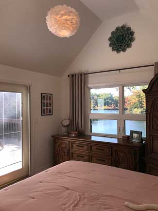
Facing the lake, the bedroom has a window with a lovely view, and a door that opens to a deck. To fix the low, flat ceiling, we removed the ceiling joists so that now you can see the underside of the roof. There had been an attic above the ceiling, but it was not needed, so we removed the attic. The result is an increase in volume without increasing the floor space. Along with this new ceiling came new lighting to brighten the larger space.
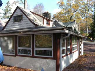
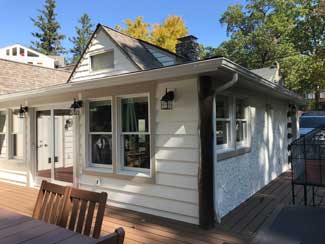
The original wrap around porch had a low roof over it and a door to enter the home that was too low for some folks. The porch roof was removed and it was raised 18 inches to match the height of the cabin and to accommodate a regular height door. Raising the roof in that area was barely noticeable from the outside but made a huge difference on the inside.
There was room to relax on the deck, but no stairs that lead to the ground level. The owner had the option to create those stairs during this project. She also knew it was minor construction that could be scheduled in the future, which is what she decided to do. In many projects, you don’t have to feel pressured to do everything at once, and with our guidance, she was able to make the most comfortable choice for her timeline and her budget.
When you buy a house, there are features you just fall in love with right away – but typically there are issues you want to fix. Rather than move in and deal with challenges for months or years, why not schedule a design consult with us to understand what’s possible before move-in day?
It all starts with a phone call – even if you are years away from starting, it’s never too soon to have a conversation.
Do you have transformational dreams for your house and
simply can’t “see it happening?”
Click below to get started.
If a friend forwarded this to you, this does not mean that we have added you to our list. However, if you would like to receive our updates, click below.
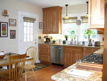
Here’s a story about a family that hated to cook – mostly because they hated the experience of being in their dark, isolated kitchen.
While we didn’t enlarge the house, make no mistake that this was an amazing transformation!
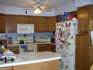
Imagine, if you will, a kitchen that is completely windowless. Although it was situated on an exterior wall, and it backed up onto a large deck and beautiful back yard, if you were in the kitchen, you saw none of that. It was such a dark room that you always had to have the kitchen light on! There was a small pass-through to the dining room, which was also dark.
On the other side, it shared a wall with the family room, but there was no entry into it! You most definitely felt locked in and isolated. Not a place to enjoy cooking or spending any time at all.
There was a peninsula in the kitchen which trapped you inside, as there was a refrigerator opposite the peninsula. The dishwasher placement also prevented the kitchen from functioning well.
The family had been living there for years, hating the kitchen, and wondering how to solve this poor design. They hated cooking and the whole experience of being in the kitchen for any length of time.
Without expanding the size of the kitchen, we gave them a renovation that affected their lives and their enjoyment of their home. They even rediscovered a joy for cooking!
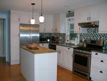
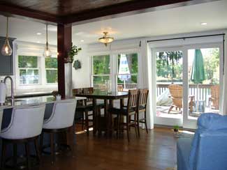
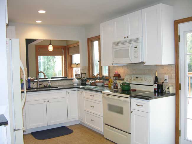
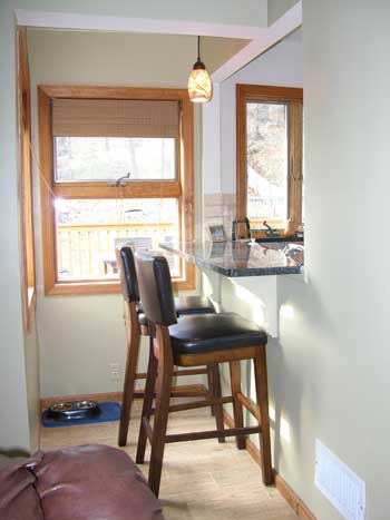
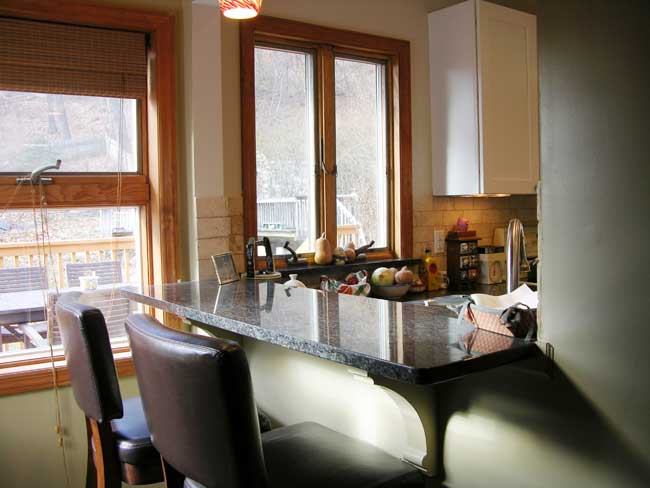
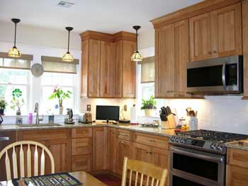
It’s now a bright kitchen with windows in the work area. In the family room there was a dead end alcove with a couple of windows, backed up against the kitchen wall. We opened the kitchen wall and created a breakfast bar. The stools are in the family room, sitting at the counter, facing the kitchen. Adding the breakfast bar connected the family room and the kitchen and brought in much needed natural light.
We replaced the small door with a large glass sliding door to the deck. The kitchen is now connected to the back yard and the deck, so the family gets much more enjoyment and use out of their deck. It had always been there, but somehow never felt appealing and inviting – now it feels more like it’s part of the house and the family uses it as much as possible.
The family was surprised and delighted at the impact of the transformation. It really touched their lives and made them enjoy the whole area so much more. They had not anticipated how much they would use their deck, and they were certainly taken aback at an unexpected benefit of the project – they now enjoy cooking! In their dark kitchen, cooking was a dreaded chore. Now it’s a pleasure!
If a friend forwarded this to you, this does not mean that we have added you to our list. However, if you would like to receive our updates, click below.
Do you have transformational dreams for your house and
simply can’t “see it happening?”
Click here to get started.
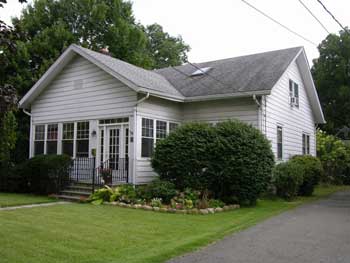
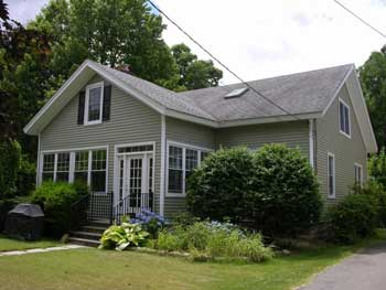
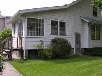
Last week we showed you the exterior transformation of a relatively modest home, and how the 2 enclosed porches actually caused more clutter problems than they bargained for.
When answering our questions about what they did not like about the interior of their house, the homeowners pointed out limitations of being able to interact with the family. The rooms felt isolated and cut off, the living room was too small, the front and side porches were underused and the kitchen was too small.
Those porches came in handy – we borrowed space from the front porch to expand the living room. Then we borrowed space from the side porch to enlarge the kitchen. We did expand the overall size of the side porch so that we could use that additional space for the kitchen. Read More→